The project
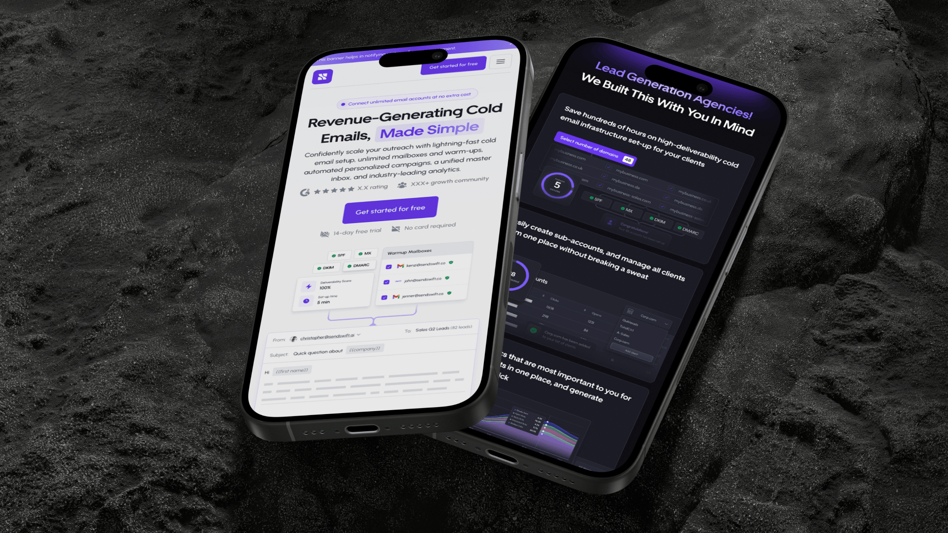
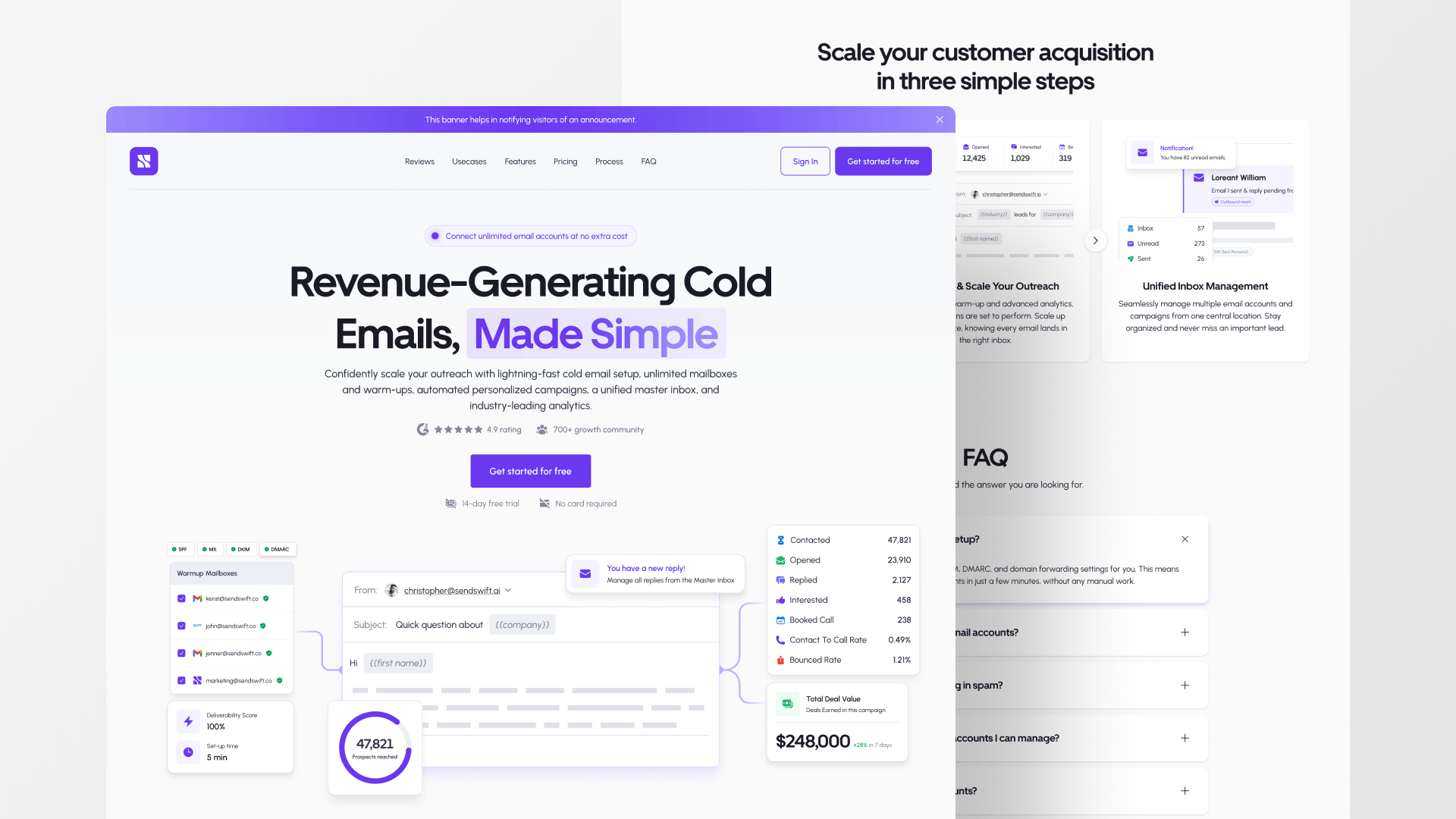
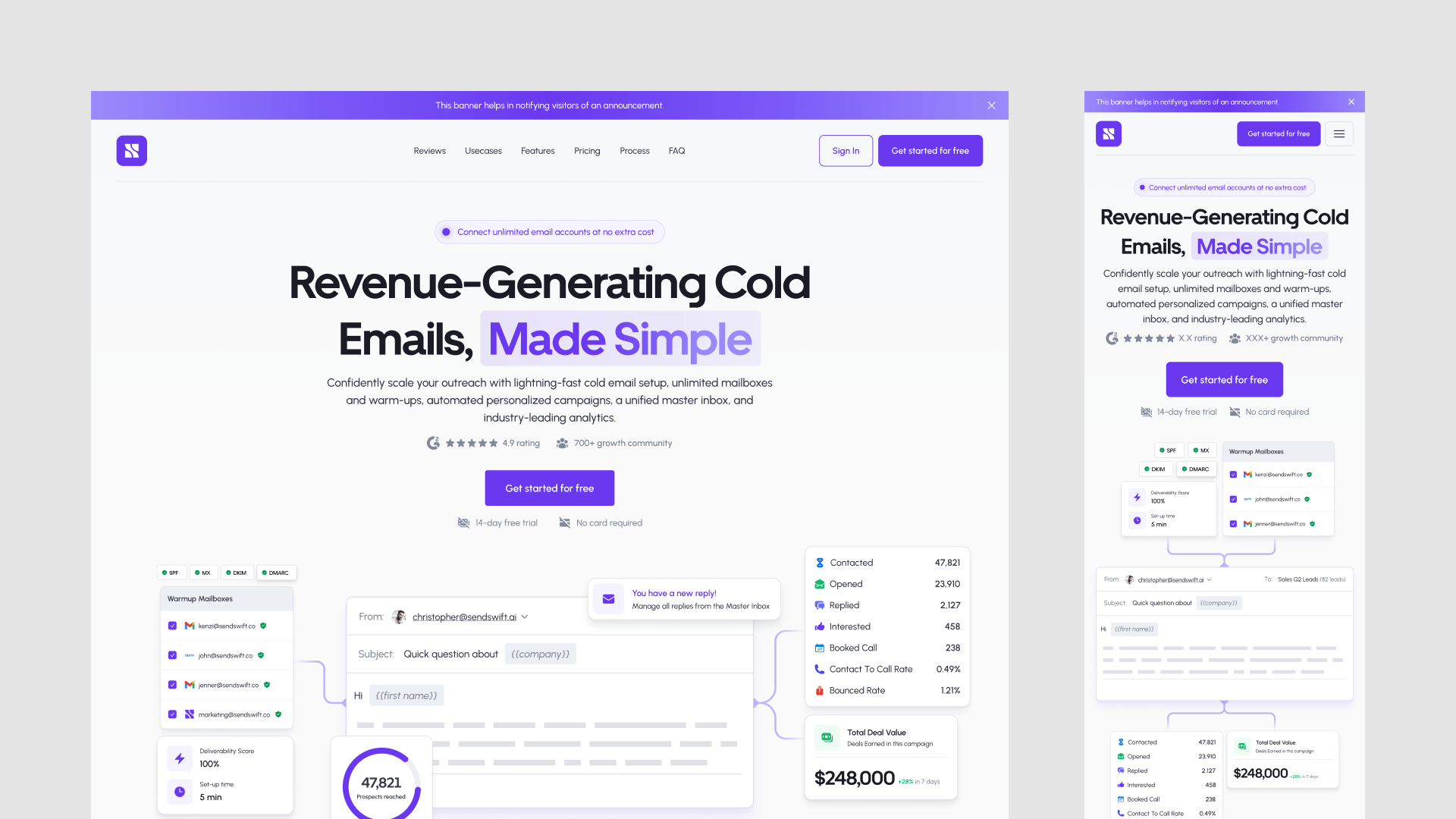
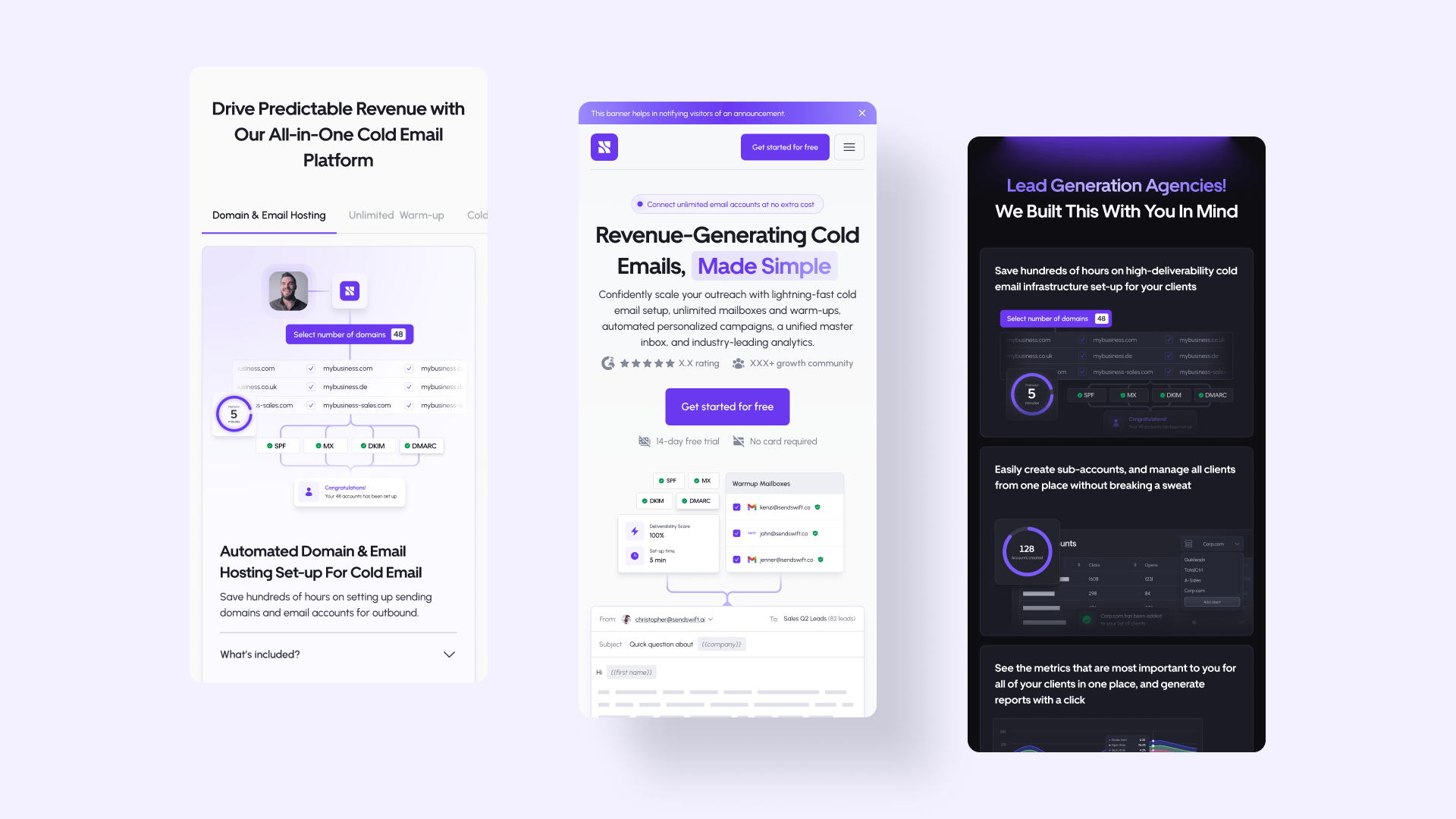
Sendswift is a SaaS startup that helps sales and marketing teams manage email operations: multiple domains, stats monitoring, email sending, sequences, and integrations with other marketing tools. We'd worked with the team before, and they came back for a full website project.
The challenge was communicating what Sendswift actually does (which is a lot) without overwhelming visitors or making the product feel generic.
The problem
The design had to feel trustworthy (like a real company, not a weekend project) while also being creative enough to stand out in a crowded SaaS market. And it couldn't chase trends. We wanted something that would look good in three years, not just three months.
What we did
We benchmarked other SaaS startups to understand which branding choices age well and which don't. Then we skipped the trend-chasing and focused on design principles that last.
Research came first: Sendswift's business model, their audience, the competitive space. Then creative exploration through multiple iterations and feedback rounds. The logo ended up as an iconic 'S' paired with the company name. Simple, memorable, works at any size. We built the color palette alongside the logo so everything felt cohesive from the start, then developed brand graphics for consistency across digital and physical applications.

Where it landed
The brand avoids trends and should hold up over time. It works across Sendswift's UI, website, and social platforms without looking stretched or inconsistent. Both teams were happy with where it landed.