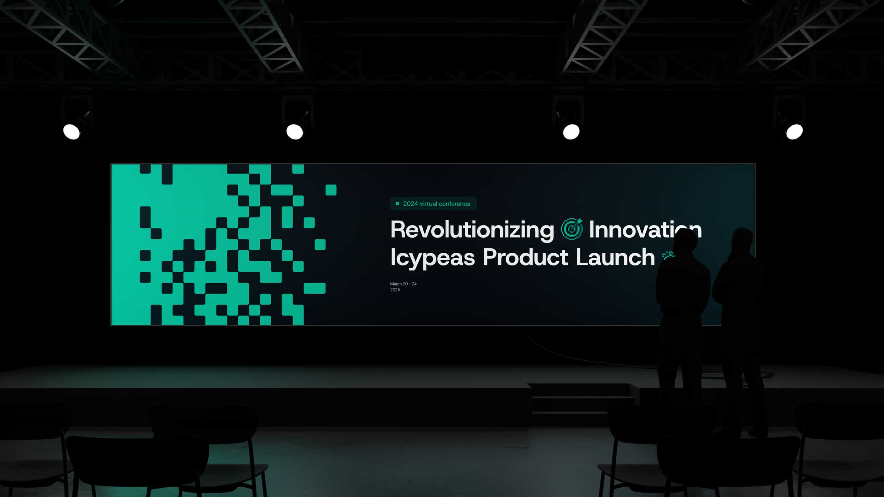
Icypeas had a product that worked. Their website didn't.
Who they are
Icypeas is a B2B lead enrichment platform. They help sales teams, agencies, and developers find and verify email addresses at scale. The product had real traction, accurate data, 99.9% uptime, GDPR compliance. But their site and brand looked like a side project, not a company competing with Apollo and ZoomInfo for enterprise accounts.
They came to us with a straightforward ask: make the outside match the inside.
What was broken
The problem wasn't just aesthetics. Their sales team kept running into the same wall: prospects would evaluate the product, like what they saw, then visit the website and hesitate. The brand didn't match the quality of what they were actually selling.
A few specific issues made it worse. No one on the team had senior design experience, so creative decisions were made ad-hoc. The existing site was hard to update, which meant new features and messaging changes piled up in a backlog instead of going live. And the site did a poor job of communicating their actual differentiators: the accuracy rates, the uptime, the compliance certifications that enterprise buyers care about.
In short, the website was costing them deals they should have been winning on product alone.
Buyers in the sales data space make trust decisions fast. If the website looks cheap, they assume the data is too. Icypeas knew this, and that's why they wanted a full rebrand, not a quick facelift.

How we approached it
We didn't start with the website. We started with the brand, because designing pages before you know what the brand actually is just means doing everything twice.
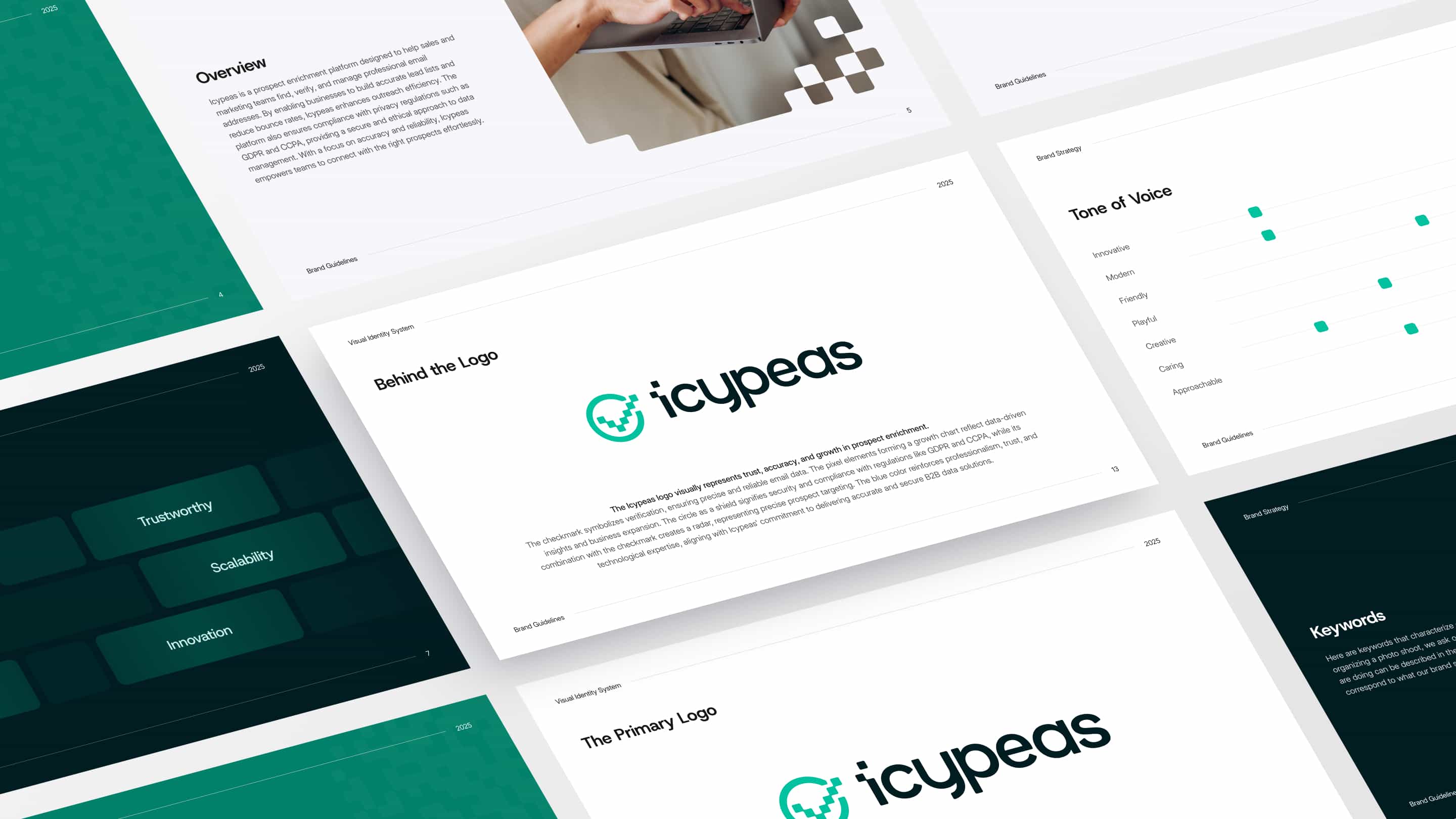
Brand identity first
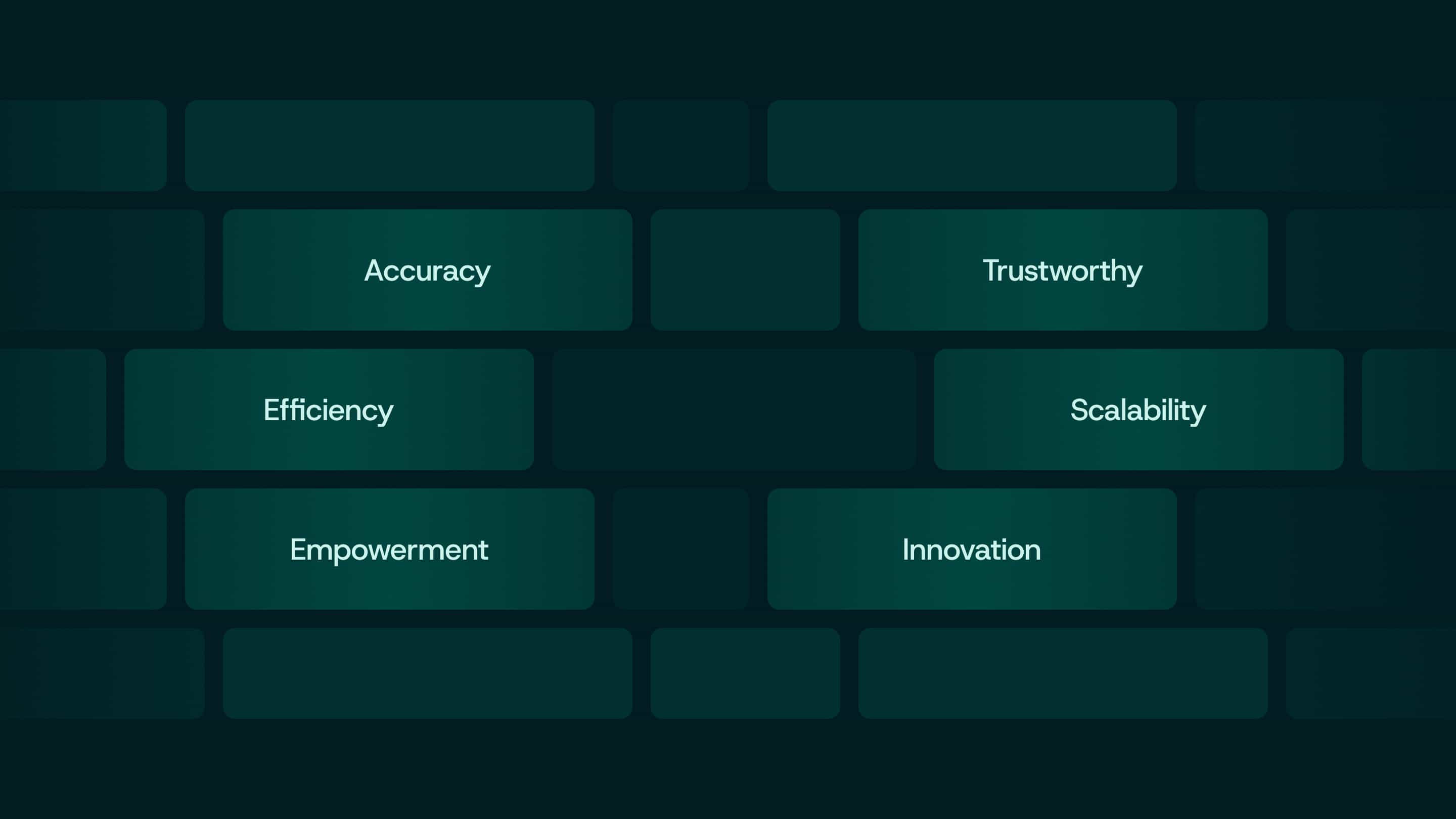
The brief was tricky: look technically sophisticated enough for enterprise buyers, but approachable enough for SMB sales teams who are the bulk of Icypeas' user base. We landed on a clean, minimal system. The color palette deliberately avoids the standard "tech blue" that every competitor uses. The typography works equally well on marketing pages and API documentation.
We delivered a full brand book with an asset library so their team could implement consistently across every touchpoint going forward.
Messaging and wireframes together
Most agencies design first and write copy later. We did both at the same time. The wireframes had real copy in them from day one, which meant we could test whether the messaging actually worked within the layout before committing to either.
Icypeas serves three different audiences (sales reps, agency owners, developers), and each one cares about different things. We built messaging frameworks for each persona, then wired those into the page structure so the right value proposition hits at the right moment.
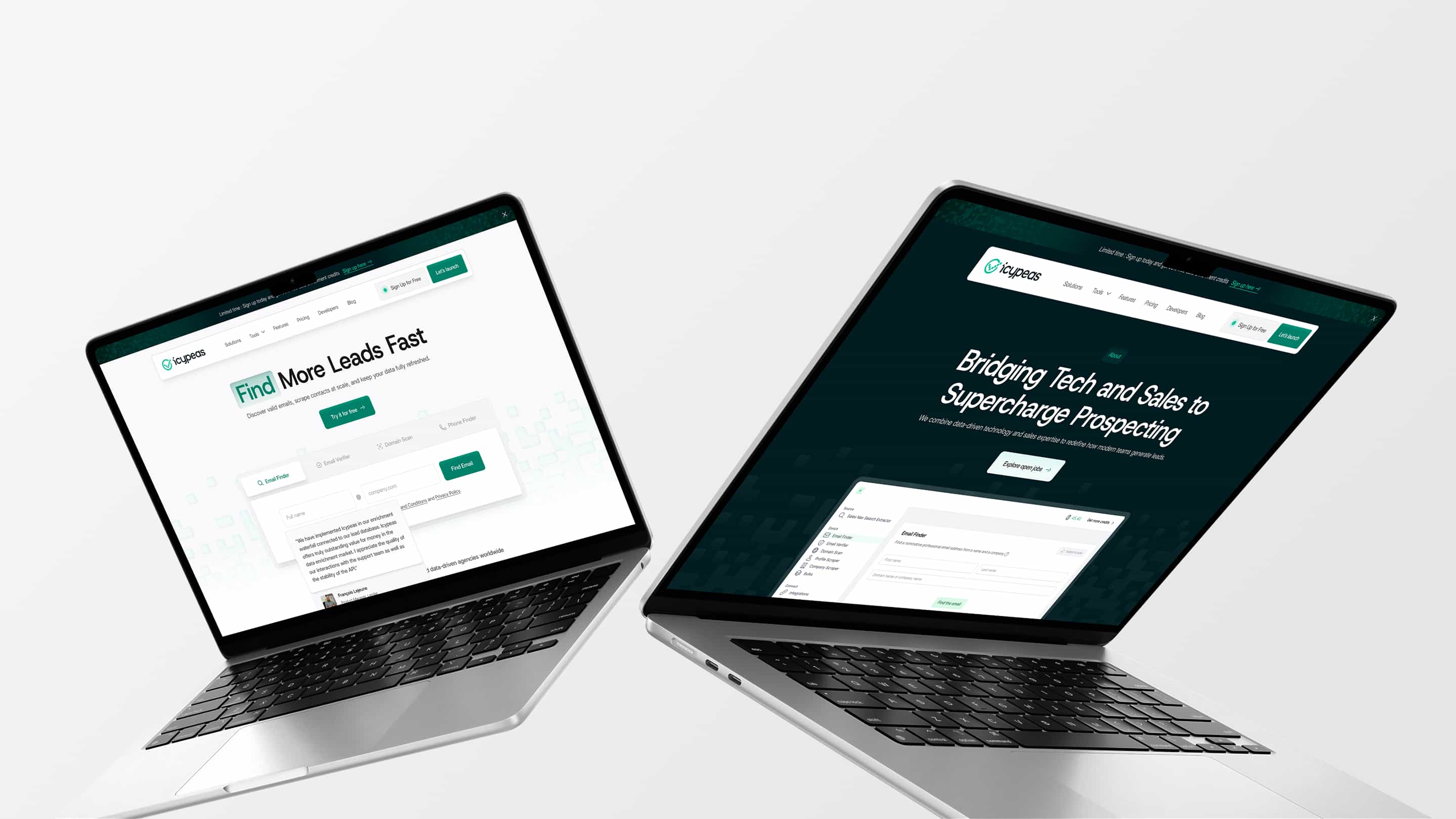
One shift that made a big difference: instead of generic "find emails faster" messaging, we focused on outcomes. "Reduce bounce rates below 2.5%." "Scale outreach without destroying deliverability." That's what actually gets someone to click the signup button.
Design and UX
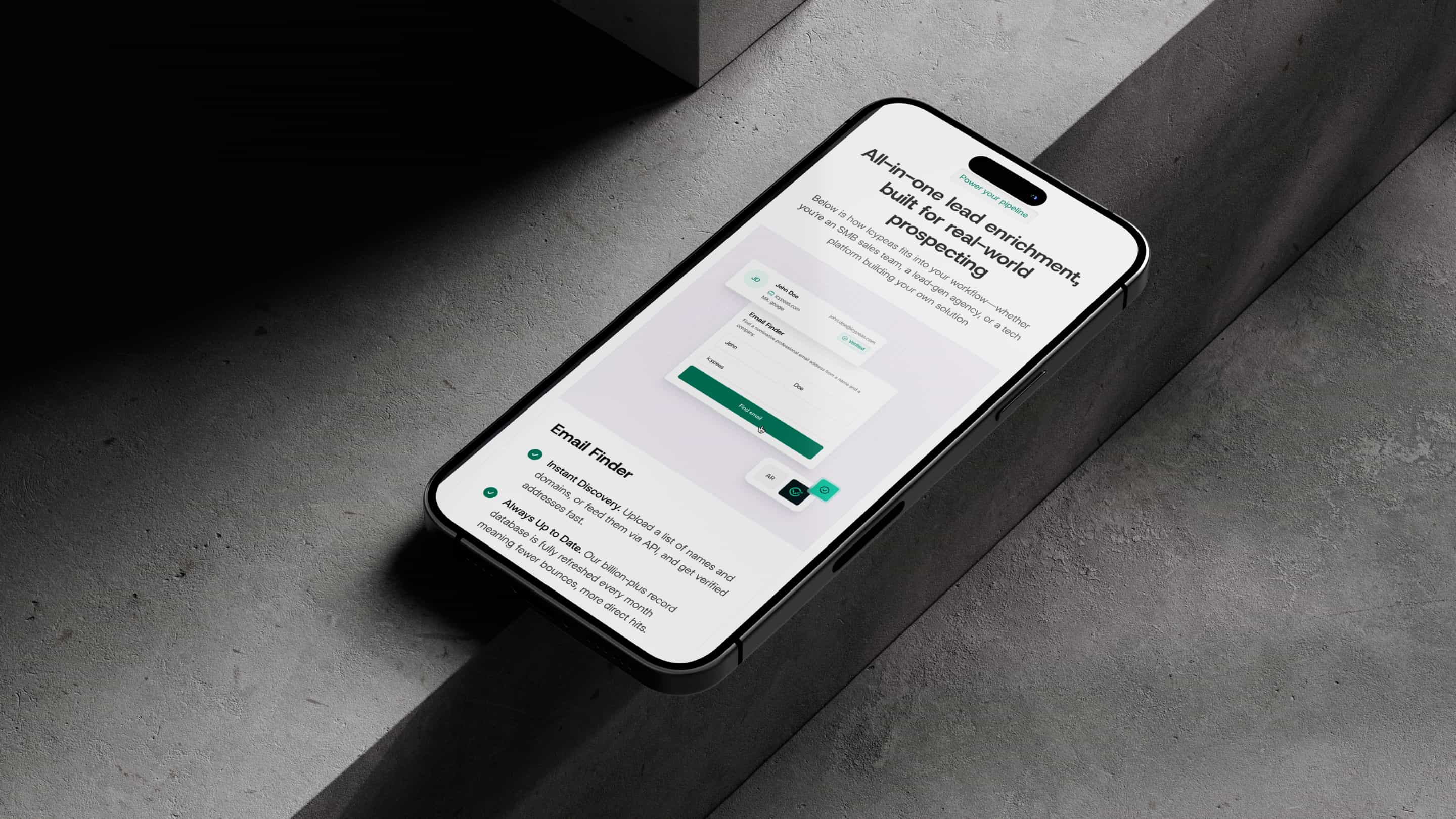
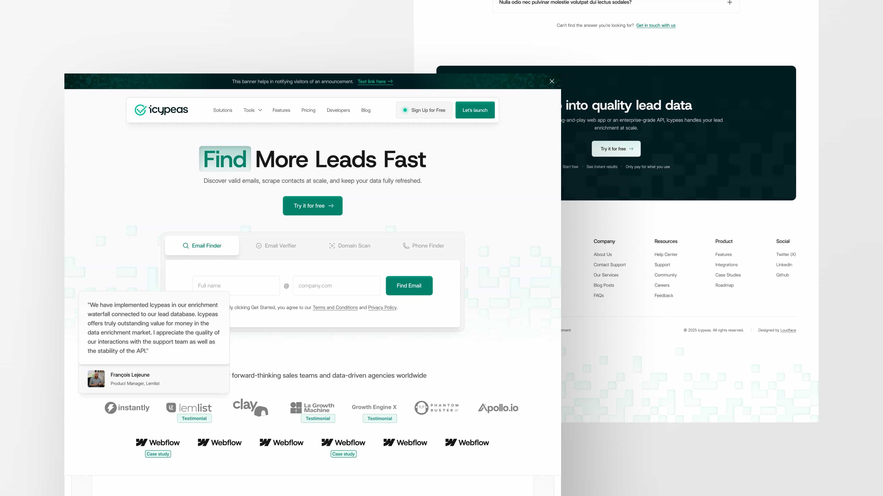
The site needed to work for two very different types of visitors: technical users digging into API docs, and business users trying to figure out ROI. We designed clear navigation paths for both, with interactive API demos that show real request/response examples without requiring a signup.
Social proof placement was deliberate, not decorative. Trust badges and testimonials show up at the points where buyers typically hesitate, not just piled into a testimonials section nobody scrolls to.
Webflow build
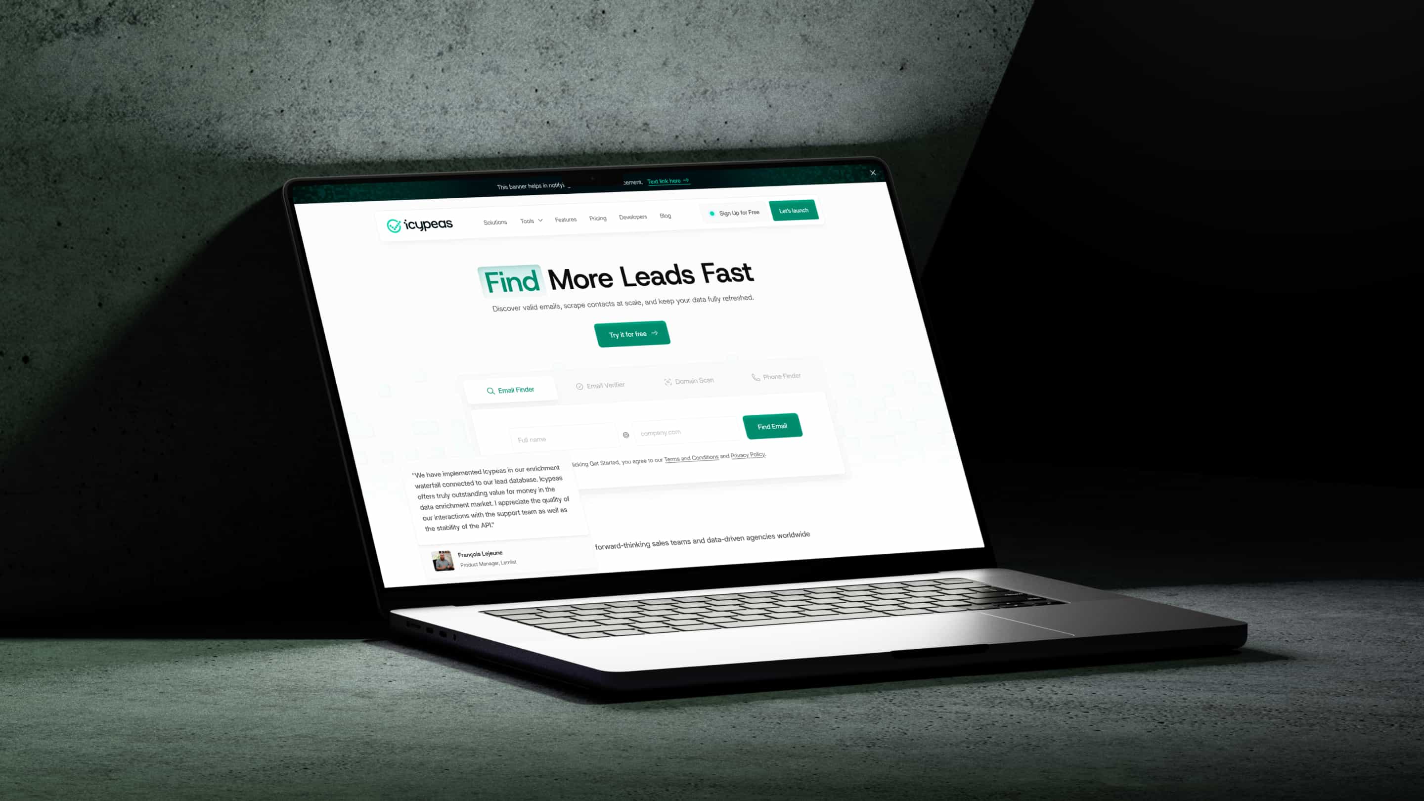
The old site was a maintenance headache. Content updates took hours and needed a developer. We built the new site in Webflow with a component-based architecture and a CMS setup that lets the Icypeas team publish changes themselves. New feature pages, pricing updates, blog posts, all without waiting on anyone.
The site is also fast. We optimized images, minimized custom code, and structured everything for search visibility.
What changed after launch
Prospects started commenting on the site during sales calls, which never happened before. The professional presentation stopped being a liability and started being an asset.
The sales team noticed the difference right away. Conversations shifted from "let me explain why we're credible" to "here's how our product fits your workflow." Less time building trust, more time closing.
On the operational side, content updates went from a multi-hour developer task to something their marketing team handles in minutes. That freed up engineering time for actual product work.
The modular design system also means they can roll out new pages for feature launches or market expansion without calling us back for a redesign. The investment keeps paying off.
Project details
Timeline was 8-12 weeks from brand strategy through website launch. The team included a brand strategist, senior designer, Webflow developer, and project manager.
A big reason this went smoothly: Icypeas gave fast, clear feedback at every stage. They understood that the rebrand was a growth investment, not a vanity project, and that made the collaboration efficient.
If your product has outgrown your brand, or your sales team keeps having to explain away a bad website, get in touch. This is the kind of work we do well.