The project
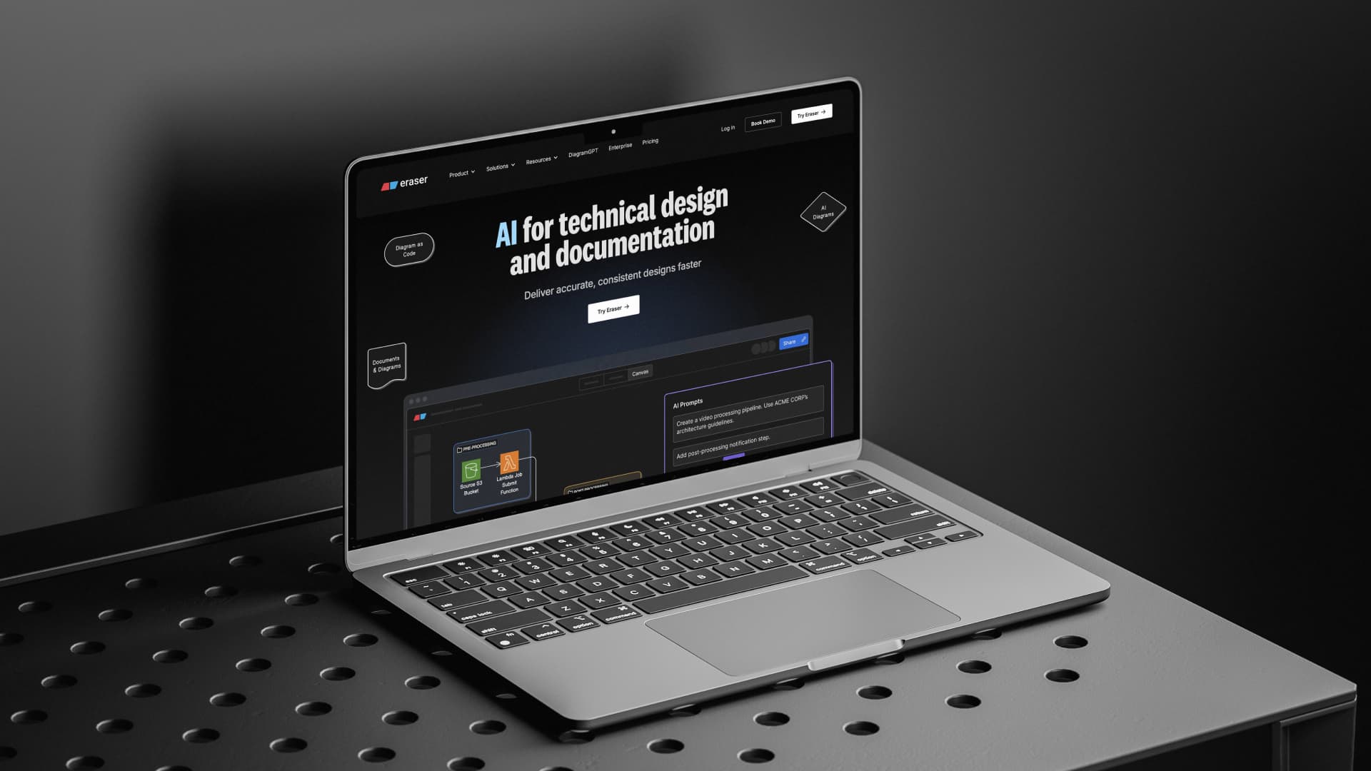
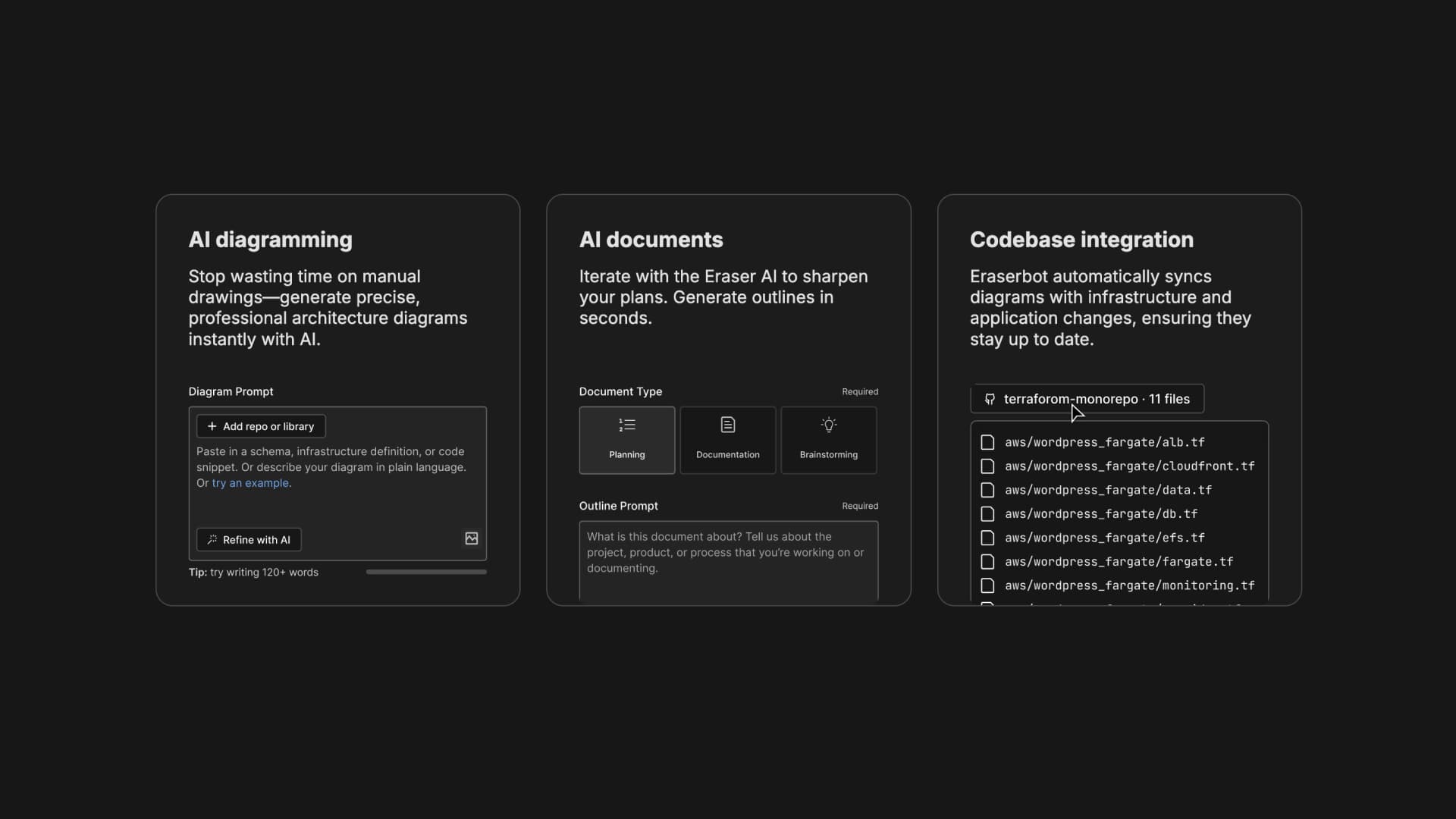
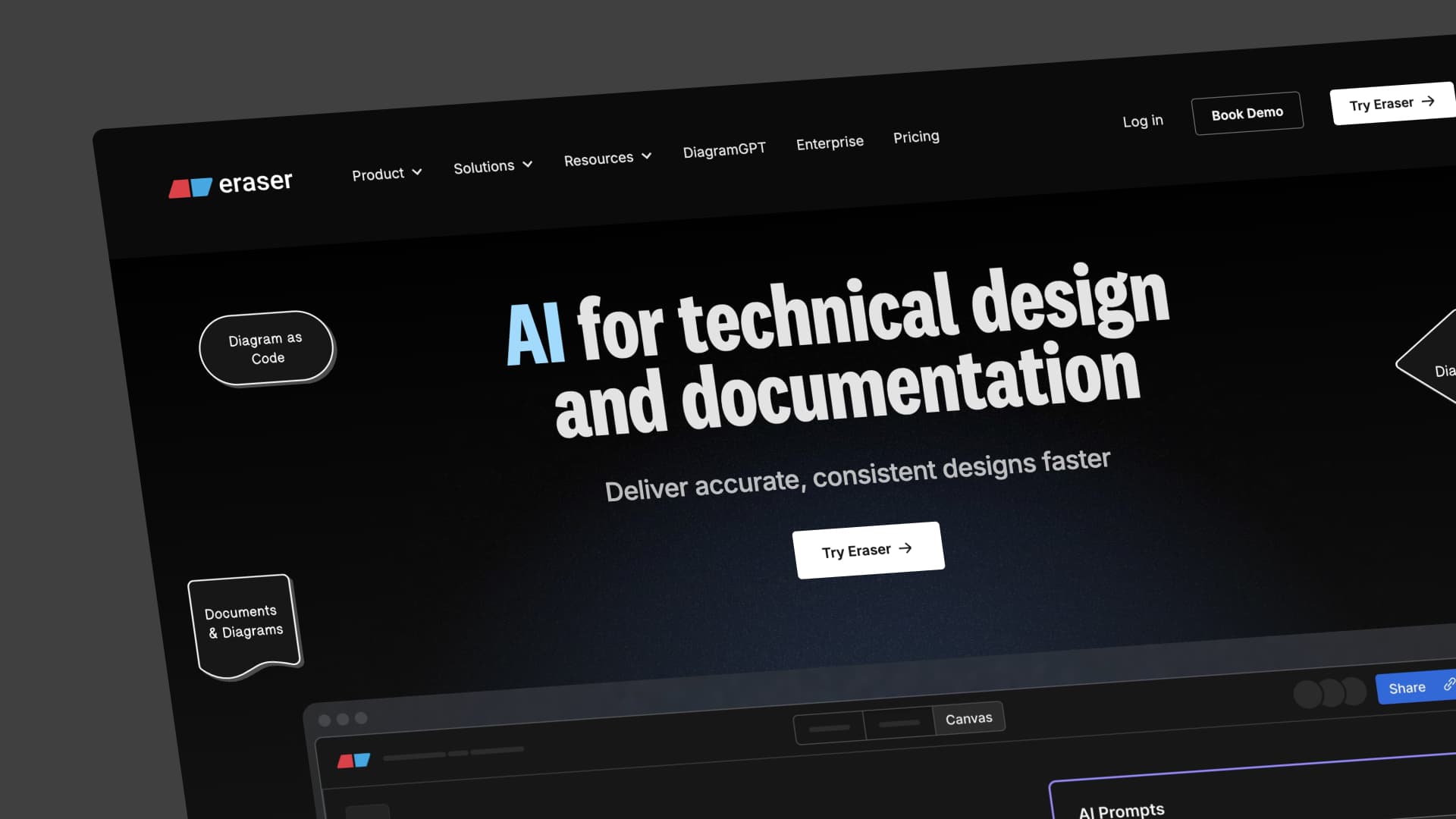
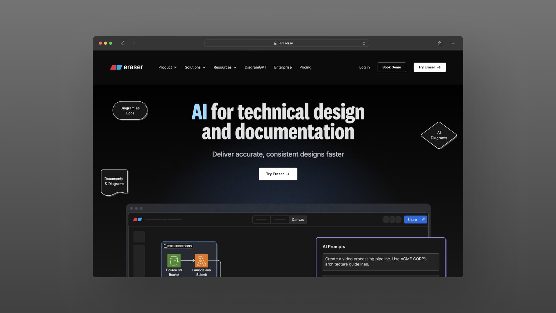
Eraser is a diagramming tool for engineering teams. It lets you create and maintain technical diagrams using code, export them anywhere, and plug them into your existing workflow.
We've worked with Eraser for years. When they outgrew their previous site design and needed a full V3 redesign, they came back to us. The project included a new brand identity, updated messaging, and a fresh roadmap for how the site should work as a marketing asset. Our team built the new site in Webflow based on designs from Eraser's in-house team, and we still maintain and update the site as they grow.
What they needed
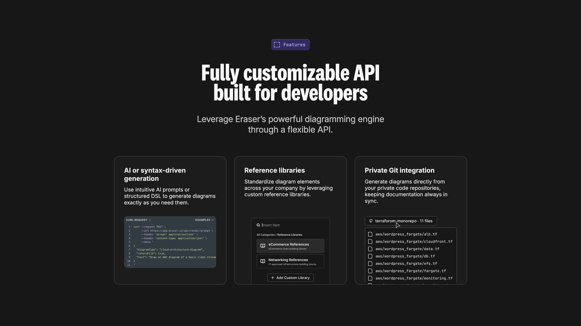
Eraser had strong internal design talent but no one to build the site. The main challenge was making it feel alive. We packed the pages with micro-interactions and animations so the site felt interactive, not static.
Because we'd worked together so many times before, we already knew how Eraser operates, what they care about, and where their standards are highest. That made execution fast.
How we built it
We ran a design audit with Eraser's designer to understand the vision for each section, how things should interact, and what the user experience should feel like. From there, we mapped out every page slated for redesign.
Then we built it page by page in Webflow. QA across every breakpoint and browser. Eraser's bar is high, so we polished until it was actually right, not just done.
After launch
The redesigned site landed well with both the public and people in the industry. Clean design, smooth animations, and faster load times all played a part.
Since launch, we've kept building. New pages for product releases, especially their AI product suite, have driven real organic traffic growth. As Eraser's product line expands, so does the site.