Webflow's CMS (Content Management System) allows you to easily manage dynamic content like blog posts, portfolio items, and product pages.
But before the content goes live, we just want a quick look to ensure everything looks perfect—from the layout to interactions and design elements. While Webflow has a neat previewing system, it isn't intuitive. And can be downright confusing at times.
In addition to basic previews, Webflow also allows users to:
- Preview unpublished CMS items (drafts).
- View content as it would appear across various breakpoints (e.g., mobile, tablet, desktop).
- Test complex interactions and animations tied to CMS data.
In this guide, I'll walk you through the different methods for previewing CMS pages and blog posts in Webflow. I'll cover everything you need, from using the Designer tool to leveraging Webflow's staging site for a real-world preview.
Previewing CMS Pages in the Webflow Designer
The Designer tool is where most developers and designers will spend their time. It allows you to see how your dynamic CMS content looks within the design framework before publishing.
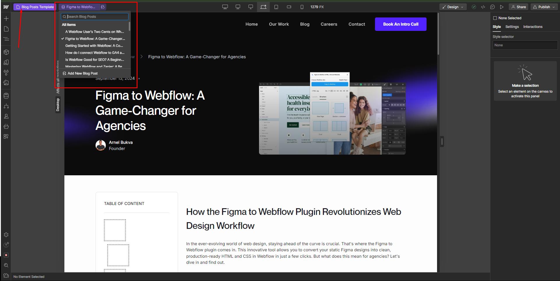
In the Webflow dashboard, click on the "Home" button on top-left and select the CMS collection you wish to preview. You will then see another scroll-down menu besides the template where you can select the specific blog page (or other CMS item).

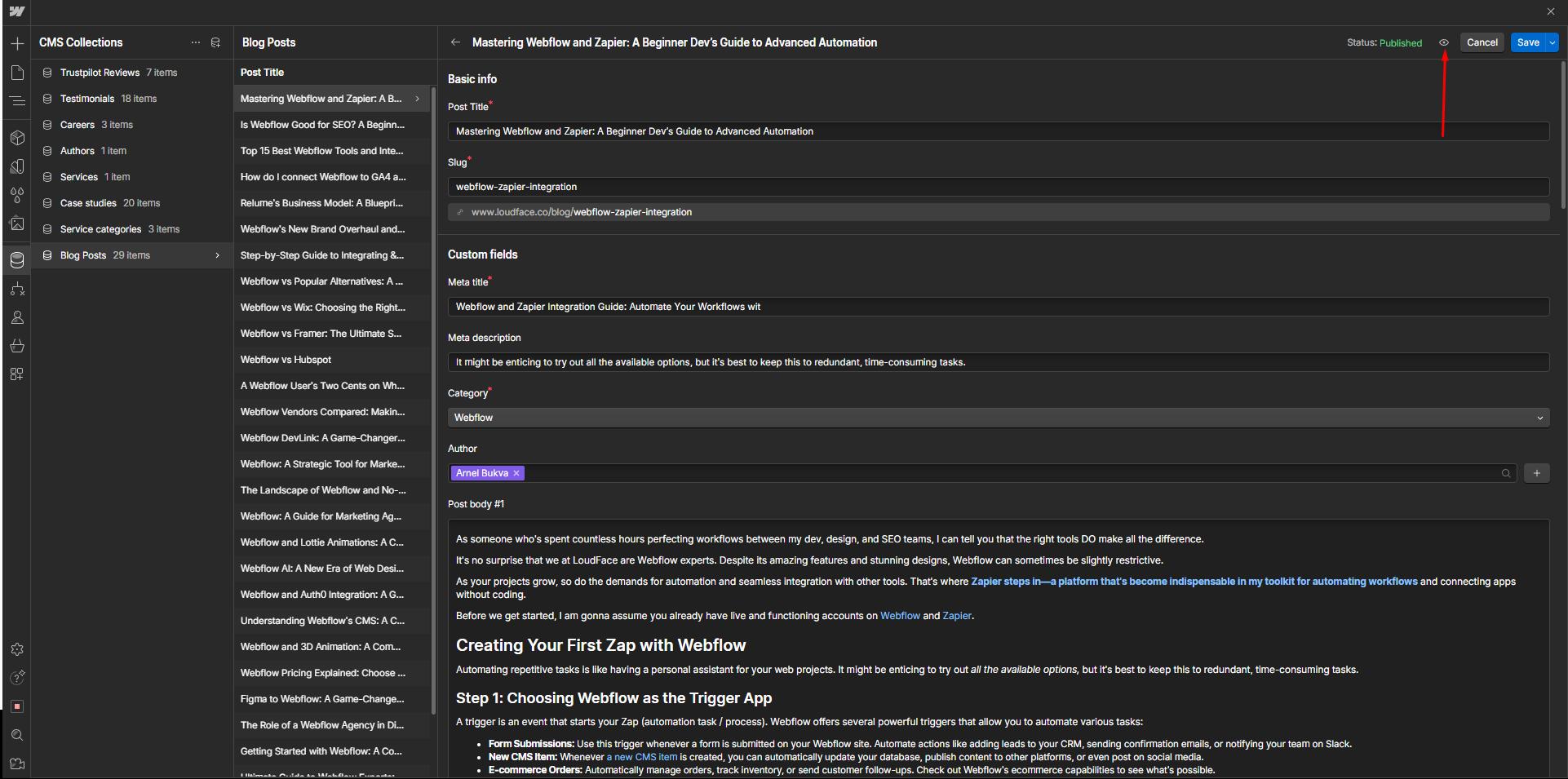
If you're within a specific blog post, look at the title bar on the top-right. Before "Cancel" and "Save," you'll see a small icon with an eye on it. That's the preview button. Click and it'll take you to the preview mode.

There are some elements that won't display in the preview and will only show up on the live site. But ideally, that shouldn't matter because they're tied to the CMS collection itself and will be the same across the board. Even so, if you want an exact preview, publish your blog on the staging site first and check the final output from there.

Using the Editor for Content Previews
Webflow Editor is ideal for non-designers who need to review or edit content. It keeps things simple while offering a real-time preview of changes, making it a valuable tool for collaborative workflow
The Editor allows collaborators to preview content changes instantly. Any updates made to a CMS item can be seen in the context of the design before those changes are published live. This reduces the likelihood of errors going unnoticed and ensures the content looks just as it should before hitting the publish button.
Previewing CMS Pages for Specific Breakpoints
Webflow's breakpoint feature lets you preview how your CMS pages will look on different devices: desktop, tablet, and mobile. This is crucial for ensuring your content is responsive and looks good on all screen sizes.
Switching Between Breakpoints: In the Webflow Designer, you can switch between different breakpoints to see how your CMS pages adjust to various screen sizes. For instance, a blog post that looks perfect on a desktop may need some tweaks to look equally good on mobile.
Responsive Design Testing: Use the breakpoint previews to catch issues like text being cut off, images scaling incorrectly, or interactive elements like buttons becoming too small on smaller screens. You can make adjustments directly in the Designer for each breakpoint, ensuring a seamless experience for users across all devices.
Common Issues When Previewing CMS Pages
Even with Webflow's robust CMS, it's possible to run into issues while previewing CMS pages or blog posts.
1. Content Not Displaying as Expected
A common frustration when previewing CMS pages is content not appearing as it should. This could be due to several reasons:
Incorrect Field Bindings: If your CMS fields aren't properly connected to the elements in your design, the content will not display. Check your Dynamic List and Collection Page Template to ensure each field is correctly linked.
Head into the Webflow Designer and open your CMS Collection Page. Ensure that each content block (e.g., titles, images, body text) is connected to the right field in the CMS. If you see a "No Items Found" message, it usually means the connection is broken or incorrectly mapped.
Empty or Missing Fields: For example, if a blog post is missing an image, that section may not render as expected during the preview.
Check the individual CMS items to ensure all required fields have been filled in. You can use Webflow's Conditional Visibility feature to hide sections that might be empty for certain posts.
2. Style and Layout Inconsistencies
Design inconsistencies between different CMS items can be tricky to catch without proper previewing, especially if your template has complex styles.
For instance, one blog post might look perfect, while another throws off the layout entirely.
This is often the result of content length variations, like a title that's much longer than expected or a large image throwing off the alignment. We had a similar issue a couple weeks ago.
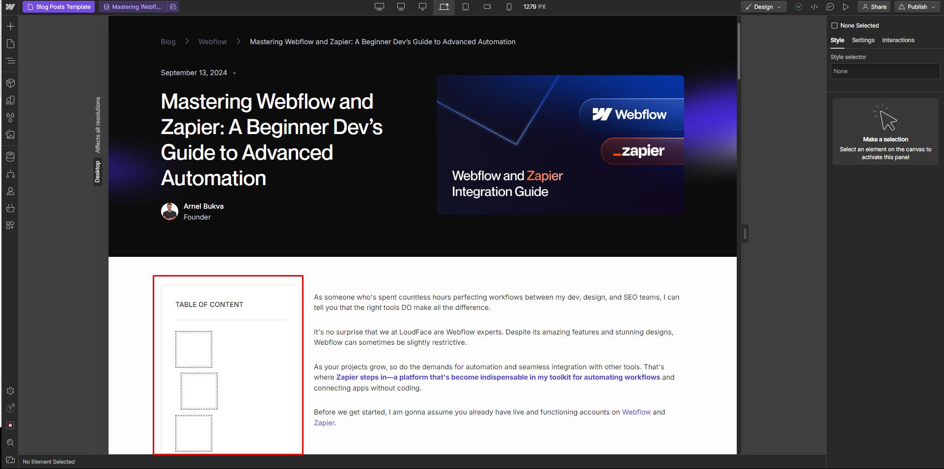
In one of our posts, we had used Webflow's in-built code previewer to display some JS scripts on the site. It was an immovable element pushing the table of contents widget into the far left.
Use the Preview Mode in Webflow's Designer to manually test how different CMS items look. You can also enable Dynamic Content Overrides to test extreme cases, such as overly long titles or large images. Use Flexbox or Grid to create layouts that can adapt to varying content sizes without breaking the design.
3. Responsiveness Problems
Previewing your CMS pages on different devices can reveal issues with responsiveness, such as content not fitting properly on mobile screens or elements overlapping.
If your layout hasn't been optimized for smaller breakpoints, the CMS content may break your design when viewed on tablets or mobile devices.
Webflow allows you to easily switch between breakpoints in the Designer. Preview your CMS content across all breakpoints (desktop, tablet, mobile landscape, and mobile portrait) and adjust the design accordingly.
Use Flexbox and Grid Layouts to create flexible designs that adapt well to different screen sizes.
4. Interactions Not Working
Sometimes, interactions that work fine with static content may behave unpredictably when applied to CMS-driven content, especially if the CMS items vary in structure or length.
The issue can often be tied to how elements are dynamically generated through the CMS. Return to the Interactions Panel in Webflow and ensure the triggers and animations are correctly linked to dynamic elements.
Test the interactions with multiple CMS items to ensure they behave consistently across all content variations.


